Sunday, January 26, 2014

Commission Work. Meet my subjects!


Meet my future paintings!

The Great Dane's name is Harley.

The Rat Terrier is Molly.  (Molly has passed.)

and

The Chihuahua's name is Rocky.  

They all are the "fur" babies of a lady named Krystal.  

The next few days you will see these babies come to life in pastels.  

Saturday, January 25, 2014

Day 25 of 30


"FLY AWAY"

8" X 10"
Acrylic

$100

Colors used:
Titanium White
Ivory Black
Mars Black
Payne's Grey
Ultramarine Blue
Cerulean Blue

Friday, January 24, 2014

Day 24 of 30


"Arabian"

"Nu" Pastels
11" X 7.5"

$25
(Shipping $13)

I decided to try out my box of "NU" pastels since artists rave about them all the time.  Well, I'm not fond of them, I STRUGGLED to paint this and if you know me, I don't like to struggle.  One time I was painting with another artist, and I was painting a watercolor of a rose and it just wasn't working, so in a fit of rage, I tore it to shreds.  She opened her eyes wide and her draw dropped in total shock of what I had done.  But she learned from that.  She (and I) learned it's okay to scrap a piece of work if you are frustrated.  I nearly did it to this one but I gave my self a break.  Why?  Well, I'm in this painting challenge which is enough stress on it's own, besides that, I'm painting with what feels like a whole new medium, (I found out I don't like HARD pastels), and also, it's only the second time I've tried to do a horse.  I decided to be kind to myself.  Over the years I've learned you just never know what someone will buy.  One man's trash is another man's treasure!  

The other reason I wanted to do a horse in NU pastels (which are hard thin sticks of pastels), is I wanted to do a quick study of whether I wanted to work in pastels or oils for painting the horse for the cover of the book I will be doing by year's end.  Yup, it will be oils!  (SO MUCH EASIER!)

Part of the frustration I had as a child coloring was I didn't want to be the one filling in the lines, I wanted to be the one MAKING the lines.  As a small one, that was the best way I could describe that I wanted to be an artist.  Back when I was a kid growing up in the late fifties, early sixties, my Mom could give me a coloring book and crayons and I'd be good for hours!  (I'm sure she did most of her housework knowing I wasn't straying from wherever I was working.)  But I was frustrated because all I had were crayons.  Back then, kids didn't have markers and watercolors or more.  Just crayons.  Good thing I grew up in the town where they make CRAYOLA crayons...which is Easton, Pennsylvania.  It's a company called "Binney & Smith".  They are also the manufacturers of Liquitex supplies.  (Ah, now you know why I LOVE Liquitex!  My secret is out!)  

Here's some trivia for you.  If you have a real old box of Crayola crayons, turn it over and look at the back, it says, "made in NY, NY".  NOPE!  The BOX was made there.  The crayons were made in Pennsylvania.  How they got away with that for years is beyond me.  But, that didn't last, and now it reads correct.  (You know I still have my crayons from back then, don't you?)  

Oh, and that magical box of 64 with the sharpener on the back of the box?  The box is built around the sharpener, not the other way around.  Now you know!  

So being frustrated as a child doing my art, then developed into the frustrations of deciding if I work in oils, acrylics, watercolor, pastels, graphite, charcoal, pen & ink?  Does it ever end?  

People sometime ask, "How do you know if you're going to do it in what medium?  Sometimes I know for sure, as some things just lend itself to certain methods of creation, but then there's days like today that are experimental, and that adds to the charm of learning.  Always learning!  

Never give up!


Thursday, January 23, 2014

Day 23 of 30

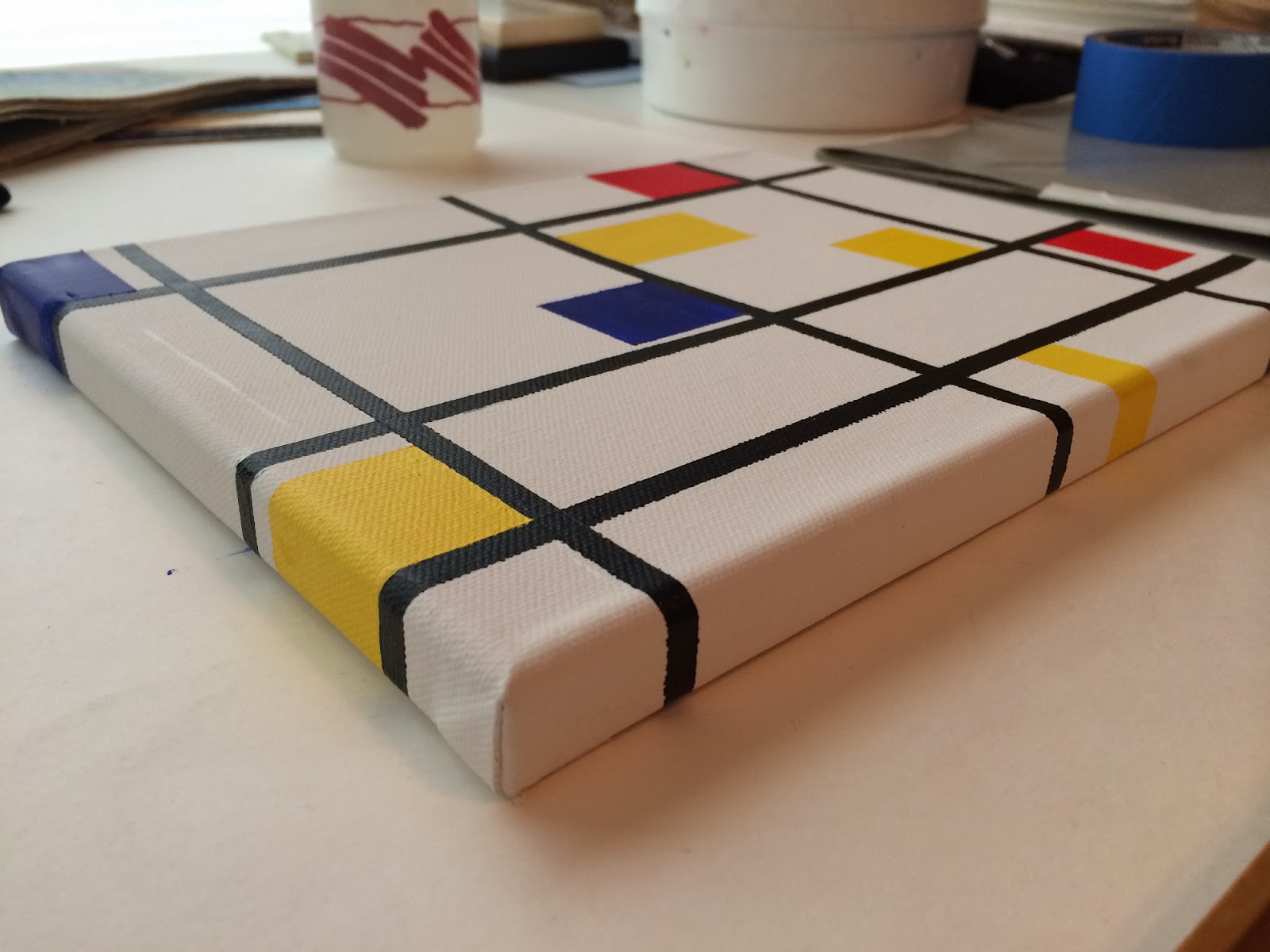
Today's painting is a minimalistic painting done in acrylics, after the famous painter Piet Mondrian.


I don't know what the true name of the painting is, so I'm calling it,
"Geometric Minimalism" 

It could be hung on it's side as well.  That is one of the design elements which made Mondrian stand out in the art world.   


Since this is a copy of a famous painting, and I'm sure it has copyright laws, I can't sell this version of it...HOWEVER...if you purchase another one of my paintings, I can "gift" this to you!

Here is a side view to show it is painted on a gallery wrap canvas, on all four sides, ready to hang.  I don't have it wired because it's for you to decide which way you'd like to hang it.  


I only used one brush to paint it, and that was an angular shader.

The colors I used were:

Titanium White 
(For touch ups, and also, mixed with the yellows to make it opaque.)
Mars Black
Cadmium Red Medium
Cadmium Yellow Light
Cadmium Yellow Deep
Ultramarine Blue
Cerulean (used with the ultramarine to make it opaque)


Day 22 of 30 (posted late)

This painting took two days for me to paint.  I just wanted to take my time with it, that's all.  So that means, by later today, I have to create another painting to keep up the pace.  I have no idea what I will paint, but I think I'm leaning towards another palette knife painting done in acrylics.

Here is the painting for day 22 of 30.  I titled it, "Colorful Glass"


"Colorful Glass"

6" X 6"
Acrylic
Gallery Wrapped Canvas

$75
(not including shipping)

Here is a photo to show you how it's painted all the way around the canvas so no frame is needed.


People comment on my water container I use for my acrylic painting all the time, so I thought I'd share with everyone what it looks like.  


I call it my "toilet".  Haha!  You can find them in art supply catalogs and I absolutely love it.  As you can tell it also holds a few brushes!  Here's how it works.  Your water is in the upper plastic container which after you fill with water, it gets turned upside down into a specially formed space.  That blue tab in the front is what washes the water into the layer below, doing the same job a toilet handle does!  It flushes out the dirty water and clean water comes from up above.  Wish I had invented it!  

Here is a photo of my gray palette.  I put my acrylic paint on a wet paper towel, which allows the paint to stay fresher longer!


I don't always use a gray palette, so you know.  It was one of those things I wanted to try to see if it made a big difference with color mixing.  It might for some but for me, no big difference.  

The colors I used are all by Liquitex.  

Titanium White
Ivory Black (for mixing colors since it is a cool black)
Mars Black (for when I want a deep black)
Cerulean Blue
Brilliant Blue
Ultramarine Blue
Cadmium Yellow Light
Cadmium Yellow Deep
Alizarin Crimson
Cadmium Red Light
Cadmium Orange
Deep Magenta
Raw Sienna

I used four brushes as pictured above:

3/8" Simply Simmons Angular Shader
Royal #5 Round (soft-grip)
Loew-Cornell 7500 Filbert #10
Robert Simmons E50 Script #1

Here's a brief synopsis of how I used each brush.

The Angular Shader (probably one of my favorite all time brushes) is one to get clean crisp lines while painting, perfect for making those corners for boxed shaped items, or even for creating the curve of glass.

The Royal Round brush is used for general overall painting.

The Filbert brush is used for blending.  It's shape is flat but it is rounded on the edges, so whether you're trying to get the roundness of glass or the curve of a cheek, this is the brush to use!  It blends wonderfully!  Highly recommend it.

The Script brush is for over all detail.  One major way to use it is to not just use the tip, but to really press down on the brush, don't be afraid!  Don't over load the brush!  When you load the brush, don't use too much paint or too much water, just enough of each and after you mix your color, twirl the brush out of the paint to achieve a real nice point.  

Hope you enjoyed today's painting!  


Wednesday, January 22, 2014

BOYS ARE SMELLY


A few years ago, Joyce Marie Taylor and I co-authored two books together.  She has written many, many books.  She is currently writing the sequel to this book of hers titled "Boys are smelly", and she just asked me if I would do the cover art for the sequel book, which will be out sometime by the end of the year!  

This is the second time she has asked me to grace one of her covers!  

I'm so excited!  

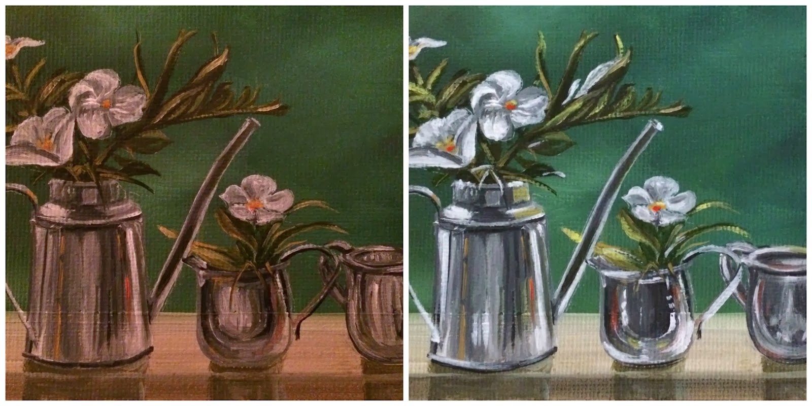
Changes made to still life painting!

Sometimes you just need to rework a painting and most times, you'll learn something from it.
In this case I learned how to make sure I take photos of my paintings in the future, in the daylight, it makes such a difference in the appearance!


On the left is the before and on the right is the after.  
I really worked the smaller silver pieces, and added in some white flower on top, as well as 
"punched" up the white in the flowers, as they looked dull.  
What a difference!


Remember playing that game as a child, "Find the differences?"


Good things happen when I can't sleep!  Haha!