Here is the final painting.
I wanted to show how I created this, so while painting it in pastels,
I took as many paintings as I could every step of the way.
I am hoping this helps others as they need it to!
First of all, this was the painting from which I worked.
This is the view from Front Street in the town of Lahaina on Maui.
(That's pronounced LA-HIGH-NA).
My husband took me there for Christmas and New Year's 2011-2012.
First I study the painting and look at my pastel collection and try to figure out what colors would work. I know in advance, I probably have the color, but unlike oils and acrylics, pastels truly vary in color variety. (Which is GREAT!) But...it's not like you can go in a store and ask for a particular color, as MOST art supply stores don't sell them that way the way they did years ago. My guess is they didn't sell as much Kaput Mordum as they did Prussian Blue, if you know what I mean. Kaput is a deep brown but most wouldn't know it by name. That's a problem with pastels, you go by guessing which color to use. (For those artists who say they know every color pastel they have, I am here to tell you they either have an extreme limited palette of colors, or they're full of it. I believe the latter.)
Once I have a few colors, I decide my surface. One of my favorite surfaces is a pastel paper made by Canson. (I believe it's full name is Canson Mi-Tienes.) This particular sheet of Canson is pinkish in color. With pastel paper there are two sides to use, one is rougher and one is smooth. I like to use the smooth side. Either is fine to use...artists go half and half in what they like or depending on what they're painting, they chose one side or another. I personally wouldn't chose the rough side for a portrait because it would make the face look like the surface of an English Muffin (or a waffle).
Many students prefer the rough side because it allows for more pastel dust and students know they need every advantage they can get. I try to never mix more than three colors at any time because "Mud" happens then, and things look cloudy or dirty. Remember, nothing is stopping you from using a spare sheet of paper to "test" the colors in question.
So I lay down a few colors.
Most students would stop at this stage and say, "Nah, I can't do this."
But, begin to blend...and just go with it.
Notice I put a little line of blue of where the horizon line might go...but nothing definite.
Continue to blend...look how nice that sky is already forming!
The nice thing about pastels is sometimes you have what is called "happy accidents" where you begin to blend (with your fingers by the way, don't use a brush), and the blending looks way better than you could have imagined, like the way the light blue is mixing with the darkest blue of the sky...but remember, it's not done yet.
If you notice on the left hand side of this photo, what I have down for the sky isn't what the picture is showing and that is because I feel my printer's blue is different from what I recall the sky was like...so I'm going on instinct here, I can always change it later.
See how I'm adding more light yellow here?
Blend it in...oh, I decided to add even more pale yellow, which this pastel had a tinge of green in but that's okay in a sky because there is something called a "green flash", look it up!
Okay, I blended and blended and blended...and added a few clouds and some PURPLE in the clouds.
You can't imagine what a mess my fingers are at this point. I wish right about now that I had another ten fingers! Here's a hint...I use Purell hand wash to clean my fingers in between messes. Be sure your hands are totally dry before proceeding as you do NOT ever want to get your pastels wet.
Blend in, add more purples...begin to lay in some color for the water.
Those clouds need MORE definition, greater saturation of color, so I go in bolder with a deeper purplish color...most students at this point would tell me, "I would NEVER do that!" (It's only pastel, a medium you can erase and pick up the color, so just do it!)
I feel the colors need more pronounced definition.
Okay, I notice there's a little smidgen of land on the left, I'm not sure of the name, Molokai perhaps? Lanai? Molokini? Regardless, it's there. I add in some lighter blue in the water.
I keep referencing the photo for color changes...I'm liking what I'm doing, I'm fine with what I have down on the paper.
I begin the water. Funny thing is, I can't make a straight line...but...as many artists will tell you, if you make it perfectly straight, it won't look real. (Thank goodness for that.)
I add in more colors for the water, and there's a small stretch of rocks jetting out into the water.
I decide to make the horizon darker in color for contrast. I like it.
How do you get the space where the sky and the horizon meet? Take a clean finger...should I spell the word clean in caps??? Take a CLEAN finger, and with ONE swipe, move your finger from one side to the other. Do NOT pick up your finger...keep going.
(You have to be brave, the outcome is worth it.)
It's OKAY to get your fingers dirty...trust me, it's OKAY!
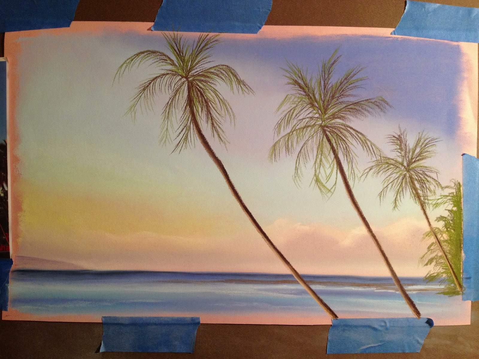
Now comes the "gutsy" part of the painting...making that almighty palm trunk stroke right through all that hard work you did for the background. Now here's some common sense tips. Figure out AHEAD of time where it starts and where it ends...so it doesn't come off looking really strange. Nice thing about palm trees is they can be curvy! Another tip is to start THIN! Trust me, these trees could get FAT real quick...so give yourself every advantage.
Continue to lay in the other two palm trees...but please, PLEASE notice, they are not an equal distant apart...the one on the left is a greater distance away from the others. Now, even if in real life they were exactly equally distant apart, I'd paint them otherwise because it would drive the viewers eyes right to that...and you want to make your painting interesting. Another tip is if there were four trees there, I'd take one out. Always work in odd numbers of things.
Continue to put in the other two tree trunks.
Remember being brave by adding in the trunk with the first stroke?
Now you need to get BOLDER with the color!
Do it to all three and then add a lighter color to the left side since the sun is setting from the left side.
It's hard to see but I added in some peachy pink as well to the palm trunks...as if the sun was bouncing off them. Brought the painting to life! Always look for details.
Begin to add the leaves. Just like you must be cautious putting in the trunk, you need to do "spider" like palm fronds. Remember not equally distant apart, and make them sway in different directions, they're not pinwheels, they're palm trees, although at this point, they may resemble pinwheels.
I usually do green first since palm trees are green. And I go light...just in case...
Since this was taken at sunset, the palm leaves won't be green-green, they'll be dark...so add some dark in a little at a time. You can always build up color and fronds.
Add in a few peachy fronds (not too many or the tree will look dead because yellowed/peachy leaves means it's dying), just enough to give it some color. Sign it...done.
Hope you enjoyed the journey and may all your artwork be a journey.
Here is the original photograph I took on the left and the final painting on the right. I changed it a bit, but I like what the end result was. Always remember, even if you work from a reference photo, there is no need to get it just like the photo, make it your own even if you're the one who took the photo!
This took me an hour and a half to produce, even with taking photos along the way. If I was to do this one again since I figured out the colors and how to work it from background to foreground, it would probably take me less than an hour to complete.
Price: $50 + shipping
Available on www.dailypaintworks.com
(Look under my name, Kathleen Kelly.)
Size 12" X 16.
I also could make this larger, $100 + shipping.