
Start by applying some pastel colors for the sky.

Blend with your fingers.

Start to add in the background island. Always work from furthest away to closest.

Blend, and then add some lighter color near the bottom, it adds some depth to the mountain.

Add in the water. Darker colors show depth in this case, sometimes it's just the opposite according to what time of day it is. It's a good practice for you to look at the ocean at different times during the day so you can see how this occurs.

With your finger, blend the two colors together to form a line. HOPEFULLY, it will be straight. In my case, it isn't so I have to go in and perform a correction. Whatever you do, do not lift your finger while blending, as this is what makes a lopsided water line. I must have twisted my finger a bit and didn't keep a firm finger on it, but with pastels, it's all correctable. Notice I left some white area for the foamy part of a wave.

I corrected it somewhat. It's not perfect but I can work with it a little more if I chose. I made some definition to the wave.

I added in some more water area and some sand as well. I'm not too worried about that back horizon line because I know once people look at the whole piece they won't even see it, besides, nothing is perfect. Now if a client asked me to redo it, I'd give it a shot if they feel it's that important. I also worked in a little definition of a cloud.

I start to put in the palm tree and realize going over that deep blue will cause the yellowish color of the palm tree to turn it green, so I get out my trusty chamois cloth and fold it up...wait until you see how well a chamois cloth takes up pastel!

Look at that! You can turn the chamois cloth to another clean spot and do it again and again. Please note, once your chamois cloth gets dirty, don't throw it in the washer and try to wash it or rinse it by hand...just throw it out because once they're washed, they never work the same.
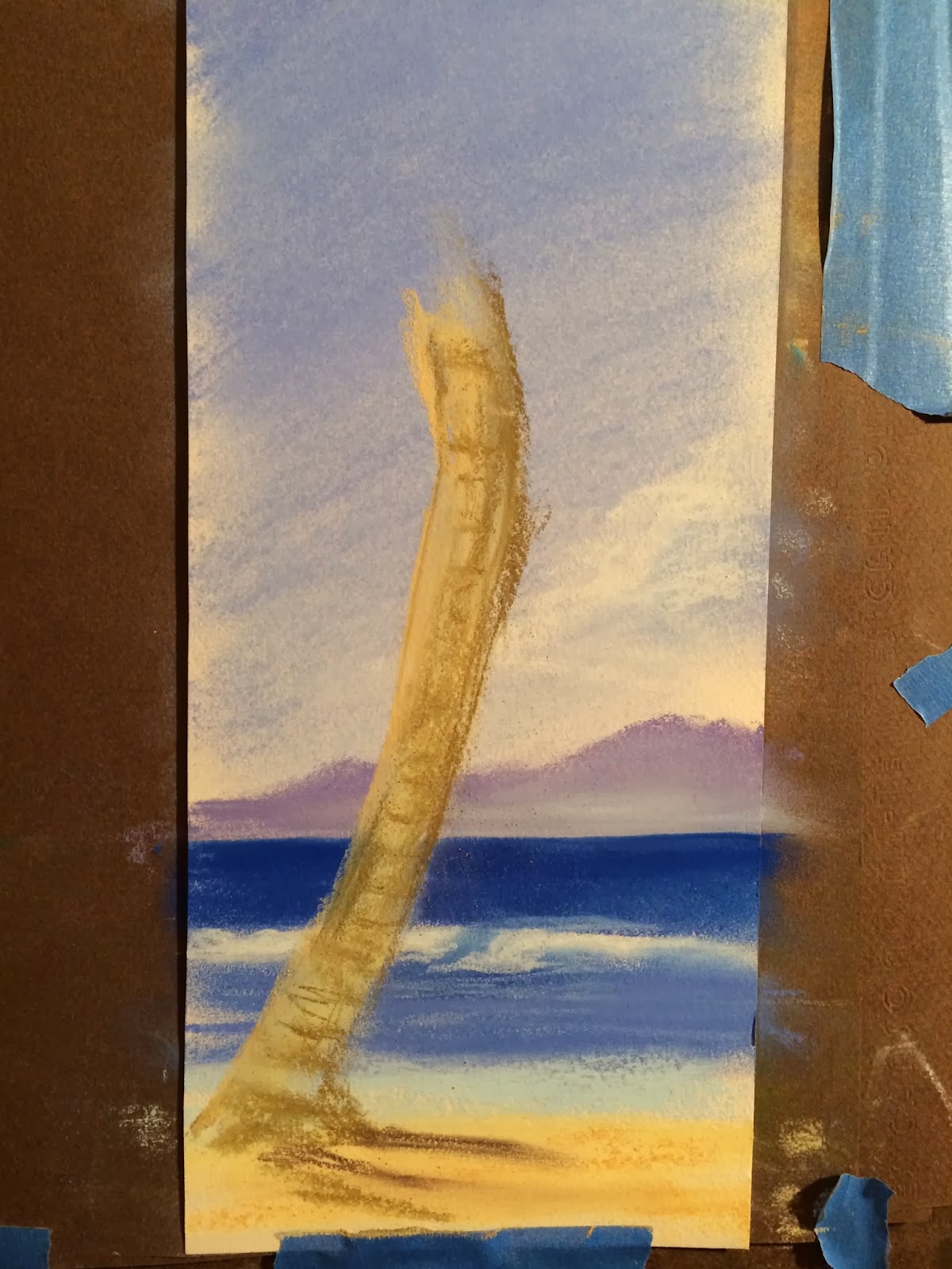
Getting the palm tree started, and as you can tell, you don't see the blue of the water in it because the chamois cloth was used. There was a little squiggle I made on the right side of the trunk, so I'm going to make that part of the trunk where a small piece of greenery comes out. I'm turning a negative thing into something positive!

Starting to fill in the palm leaves. At this point, it's just placement. Lots of work still needs to go in on the actual trunk of the tree, but you never want to spend too much time in one place, move around!

A little more in...step back and look at the work!

Add in darkness to the tree, more on the sand...hmmm, is it done? Step back and take a look.

A little more definition on the tree stump and the leaf areas. Sign it, done!

Yeah, I like it. Someone who is under a foot of snow right about now will love it.
I titled it, "See the Sea".
It measures 12"High by 5" Wide.
$25
Shipping is $10.
I will spray it with fixative before I ship it out.

Here's a little hint for everyone. I have these real small pastel tablets (found them in a material store of all places, they were only a dollar but they're not a good quality to work on as they feel like watercolor paper). So I use them as testing paper for when I'm working in pastel. Here are some of the colors I worked with in this painting, and below it, a full portrait set of pastels by Rembrant, above them, pieces of many different brands (some obsolete), and then a small round plastic container of flesh color which I purchased to experiment with. Not really thrilled with it but I'll give it another shot one day.
Hope you enjoyed my journey! If you get a chance, make a comment on here (you'll need a google account) or better yet, do so on dailypaintworks.com where you will find a lot of my work.
Thank you! Hope you learned something!

No comments:
Post a Comment